
Adjusting Your Content Strategy to Suit Multiple Digital Devices
shoemoney
·
·
4 min read
Making adjustments to your web content strategy to suit multiple digital devices is no longer just a good idea – it’s become a necessity.
With smartphones users tipped to total 1.75 billion in 2014 and tablets also rapidly increasing in profusion – the number of Android enabled devices alone is expected to surpass one billion this year – ensuring that your web content is compatible with multiple devices has no longer become a case of solely gaining a competitive edge over other businesses in your sector, but has become a requisite if your business is to reach out to as many people as it can.
Your content strategy can’t, however, come at the expense of good website design – the importance of good website design is far too important to overlook – though it’s a mistake that some have been guilty of in a mad rush to make their content suitable – or as is often the case the same – across multiple devices.
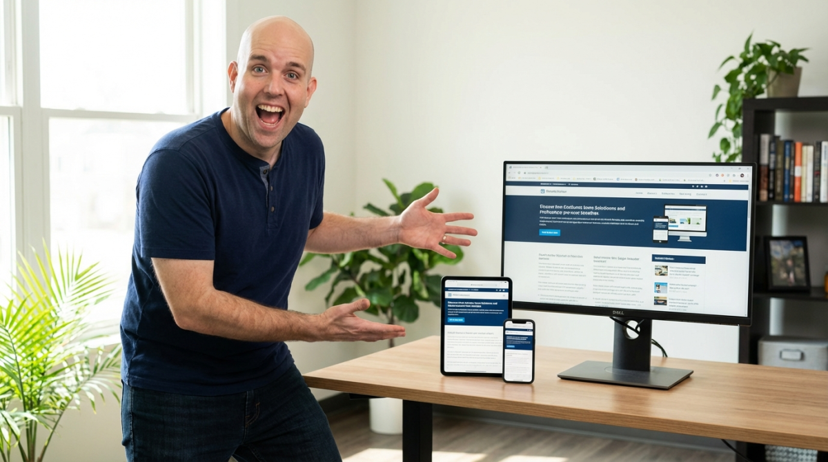
 Therefore, your content strategy needs to be different for different devices, i.e. a strategy for your website and another for smartphones and tablets.
Screen size matters – Making adjustments to allow for multi-screen usage
In addition to making adjustments to allow for differences between your website to be viewed on a desktop PC or notebook and smartphones and tablets, you also need to make further adjustments to take into account further variations in screen size – a 10” iPad is a different kettle of fish altogether from a 4” smartphone.
Here are a few important factors to consider with regard to screen size:
Therefore, your content strategy needs to be different for different devices, i.e. a strategy for your website and another for smartphones and tablets.
Screen size matters – Making adjustments to allow for multi-screen usage
In addition to making adjustments to allow for differences between your website to be viewed on a desktop PC or notebook and smartphones and tablets, you also need to make further adjustments to take into account further variations in screen size – a 10” iPad is a different kettle of fish altogether from a 4” smartphone.
Here are a few important factors to consider with regard to screen size:
- Which devices are commonly used to access key content platforms
- How long users usually spend on each device and what they access
- What device do users use at what time of the day
- Preparing to go mobile: creating familiar experiences, user context, etc.
- Choosing the right technology: responsive web design, dynamic serving, the need for a separate mobile site, etc.
- Creating great user experiences: content, layout, speed, etc.
- Measuring your success: ad campaigns, content checks, mobile reports, etc.